


Your photos tell stories.
They capture laughter frozen in mid-air, sunsets you wish you could bottle, moments you revisit even when no one else is looking. And when you print those memories — whether for your living room wall, a coffee-table book, or a meaningful gift — the finish you choose can change how that story feels every time you look at it.
Matte and glossy prints might start with the same image file, but they end up speaking in very different voices. Before we dive into the technical bits, the real question is this:
Do you want your photos to feel timeless and understated… or vibrant and attention-grabbing?
Because the finish you choose will quietly shape that answer.
Let’s break it down so you can choose with confidence.
What “Finish” Even Means in Prints
When you send a photo to print, it gets transferred to a physical surface — paper or material — that has a particular coating. That coating determines how light interacts with the print.
-
Matte prints have a non-reflective, velvety surface that softly absorbs light.
-
Glossy prints have a shiny, reflective surface that catches the eye and makes colors pop.
Both have their place, and none is objectively “better.” But understanding how they behave — visually and practically — is what helps you make the right choice for your space and your story.
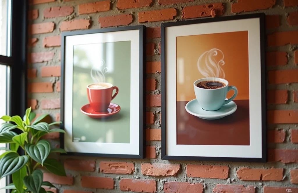
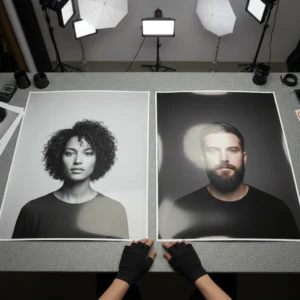
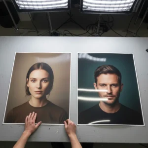
Matte Prints: Soft, Elegant, and Timeless

Matte prints feel quietly confident.
They don’t glare. They don’t shout. They simply invite you to look closer. That makes them especially appealing when you want photos to feel like art, not advertisements.
Why Matte Feels So Good
-
Minimal glare: Matte surfaces diffuse light instead of reflecting it, so your photo looks clear from more angles.
-
Elegant, understated tone: Colors appear softer and more subdued, which is often beautiful for portraits, landscapes, and black-and-white photos.
-
Less fingerprints and smudges: The texture doesn’t show handling marks as easily, great for prints you’ll touch or frame without protective glass.
-
Feels “professional”: Matte tends to read as more refined or gallery-worthy — especially on bigger prints or framed pieces.
Where Matte Really Shines
Think about spaces and scenarios that benefit from reduced glare and classic style:
-
Wall art in bright rooms
-
Framed family portraits
-
Black-and-white photography
-
Photos behind glass or under museum lighting
-
Gifts meant to feel thoughtful and timeless


On the left: Framed print with Matte finish and an acrylic top protection. | On the right: A framed print without acrylic top protection.
A Few Things to Know

Matte prints tend to:
-
Show less saturated colors than glossy — which isn’t a flaw, just a different mood.
-
Have softer perceived detail because there’s no shiny surface to enhance contrast.
If you want bold, neon-bright impact, matte isn’t meant to compete — but for emotional subtlety, it’s hard to beat.
Glossy Prints: Bright, Bold, and Eye-Catching
Glossy prints are the high-definition version of yourself.
They reflect light, intensify color, and make images pop with visual energy. That’s why glossy finishes have dominated photo albums and commercial prints for decades — they look vibrant and alive.
The Visual Difference

With a glossy finish:
-
Colors appear more saturated
-
Highlights feel brighter
-
Contrast feels sharper
-
Fine details seem more defined
This happens because the shiny coating lets light bounce directly off the surface, creating that richness and depth.
Best Uses for Glossy
Glossy prints make a strong visual impression when:
-
Photos rely on bold color palettes
-
You’re creating a portfolio, album, or marketing piece
-
Prints will be viewed up close
-
You want that “polished, professional look”
One practical Reddit-tested tip: glossy prints can stick to plastic album sleeves, especially in humid environments, which is something matte users seldom worry about.
What to Watch Out For
With glossy finishes, you’ll likely encounter:
-
More glare in bright light or under direct sunlight — which can make viewing harder from some angles.
-
Fingerprints and smudges that show up easily.
-
Slightly more maintenance if you’re handling prints often.
That slick surface is beautiful — but it demands attention.
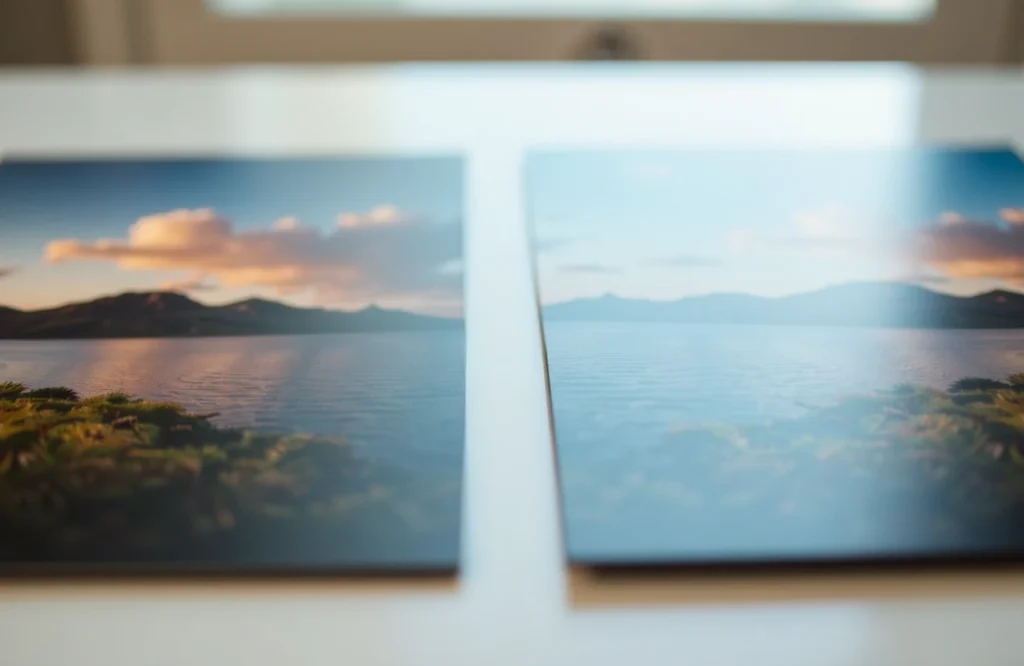
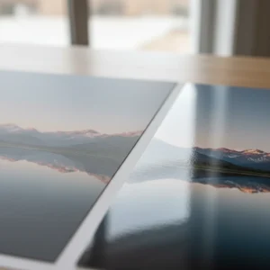
Matte vs. Glossy — A Side-by-Side Look
Here’s a quick visual of how they differ in practice:
| Feature | Matte Finish | Glossy Finish |
|---|---|---|
| Surface | Non-reflective, velvety | Shiny, reflective |
| Color Saturation | Softer, subdued | Vibrant, bold |
| Glare | Minimal | Pronounced |
| Fingerprints | Harder to see | Easy to see |
| Ideal Use | Fine art, frames | Albums, vibrant images |
| Best For | Larger formats, bright rooms | Close-up viewing, colorful shots |
This comparison isn’t about ranking one as “better.” It’s about matching purpose to potential.
Lighting Matters More Than You Think
Light isn’t just something your print sits under — it interacts with your print.
Glossy prints reflect light, which can look stunning in dim or balanced lighting, but cause distracting glare in bright spaces. While Matte prints absorb light, keeping images readable from many angles, especially in rooms with lots of natural daylight.
So before you decide, take a moment to look at where your print will live:
-
Is it opposite a window?
-
Under track lighting?
-
In a softly lit lounge area?
Lighting helps guide the choice as much as the photo itself.
What Photographers Say
If you spend any time in photography communities, one thing becomes clear very quickly: there’s no single “correct” finish.
Across countless discussions, photographers tend to agree on a few practical guidelines — all rooted in how and where a print will be used.
-
Glossy works best for smaller prints and photo albums, especially ones you’ll hold in your hands and view up close.
-
Matte is preferred for larger wall prints, where images are viewed from a distance and glare can become distracting.
-
Semi-gloss or luster finishes are popular middle-ground options, offering some vibrancy without heavy reflection.
-
Matte is often favored for framed prints behind glass, since it reduces mirror-like reflections and keeps the image easy to see.
The takeaway? There’s no one-size-fits-all answer. Real-world viewing conditions and personal preference matter just as much as technical specifications.
How Your Image Style Affects the Choice
The type of photo you’re printing plays a bigger role than most people realize. The same finish can feel completely different depending on the image.
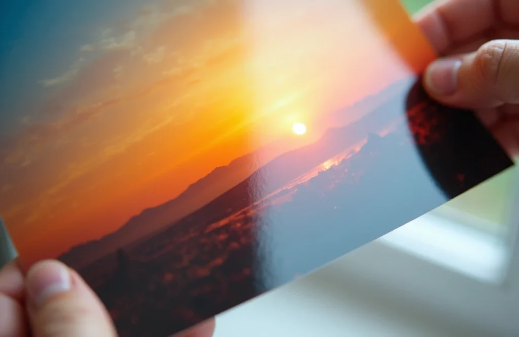
Vibrant Landscapes and Travel Photos
Glossy finishes tend to amplify color and contrast, making skies feel deeper, oceans brighter, and sunsets more dramatic. If your image relies on bold hues and visual punch, glossy can help recreate the feeling of being there.
Portraits and Emotional Moments
Matte finishes often bring out softness and warmth, especially in portraits or intimate moments. They work beautifully in gentle lighting and black-and-white photography, where mood and tonal range matter more than saturation.
Fine Art or Gallery-Style Prints
Matte’s subtle surface often feels more intentional and artistic. It allows the viewer to focus on composition and detail without distraction, which is why it’s commonly seen in galleries and exhibitions.
In many ways, the finish becomes another creative decision — just like choosing a frame or deciding where the piece will hang.
Durability & Maintenance: The Practical Side
Beyond looks, it’s worth thinking about how your prints will be handled and maintained over time.
-
Matte prints are better at hiding fingerprints and smudges, making them more forgiving in everyday environments.
-
Glossy prints look stunning but show marks more easily and benefit from careful handling.
Neither option is fragile, but they behave differently in real-world use. Knowing how often a print will be touched or moved can help guide your choice.
So, Matte or Glossy? A Simple Checklist
Before you decide, take a moment to ask yourself:
-
Where will this print live?
-
Will it be viewed up close or from across the room?
-
Is the lighting direct or diffused?
-
Do I want bold impact or quiet subtlety?
-
Will the print be handled often?
There’s no universal “right answer” — only the one that feels right every time you look at it.